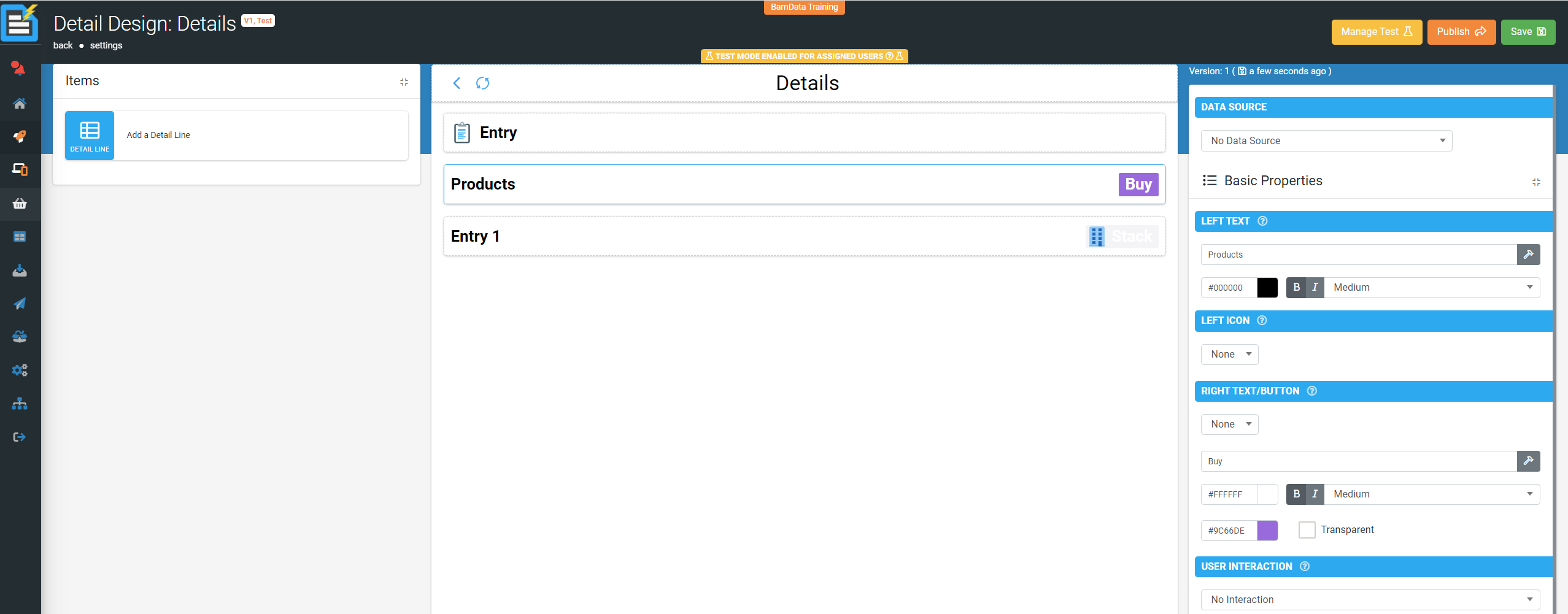
Details Screen
The Details Screen Type is a data perusal screen. It is data driven, and enables you to visualise the rows in a data source.
To add a Details Screen, on the menu navigate to Forms > Create/Edit Forms
- Name your Details Screen
- Select a suitable icon
- Select your data source (optional)

Configuring the Title bar
- Data source – a selection of connected data sources within your app to relate your configuration to.
- Form Title - This will be populated with the name of your form.
- Action Buttons - Define buttons to appear on the title bar.
- Select which button you'd like to configure, LEFT, RIGHT1 or RIGHT2
- Select an icon
- Add the button text
- Select the button colours
- Select the user interaction, e.g.

- Visibility selection check box
- Button Visibility - Control the visibility of this button using a formula
Detail Lines
Select add a detail line to create a new entry.
Data source – a selection of connected data sources within your app to relate your configuration of the detail line to.
Basic Properties
- Left Text – static text and dynamic values related to the data source can be entered here. Colour, font and text size can also be adjusted.
- Left Icon - The icon image displayed for this detailed line, no icon can be selected.
- Right Text/Button – same as left text and left icon combined but on the right hand side of the field. Colour, font and text size can also be adjusted.
A user interaction can also be configured with the same choices as above.
Layout & Styling
- Line Background – choose the colour of the detail lines background.
- Transparency tick box – select to make the background transparent and vice-versa.
Validation & Behavior
- Line Visibility - Control the visibility of a detail line with formulae and relatable data.
- Display format (retired) – a legacy value now replaced by formula functions e.g. Format-Date(), Format-Num().


 button.