
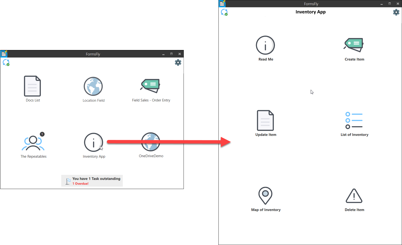
Board of Icons
Ideal for organising a set of screens that can be drilled into from a single icon on the default or custom app screen.
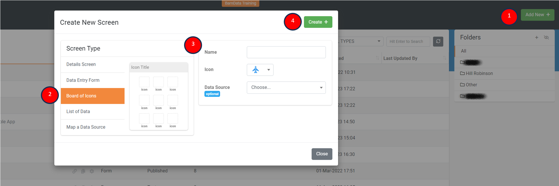
To add a Board of Icons screen, navigate the side menu when logged in to the web platform, Forms > Create/Edit Forms
- Add New screen
- Select Board of Icons screen type
- Enter a screen name and icon to display
- Create the new screen
Once created, the page will automatically load into your new Board of Icons screen. This is where you'll be able to add icons and configure what happens when a user selects an icon in the app.
The basic initial steps to follow when adding and configuring icons are as follows:
- Add icon
- Select an icon to configure, the selected icon's properties will display on the right
- Customise the icon, text and colour
- Set a user interaction
- Set the target for the chosen user interaction (Note, some interactions require parameters that can be passed into a screen or web page launched from within the app.)
- Save any changes before testing in the app (Note, force syncing the app on a user's device might be required for rapid testing)
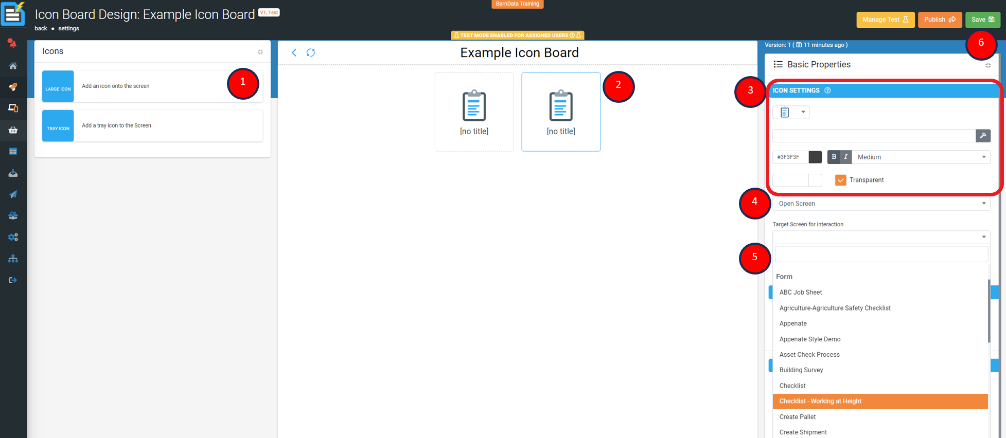
The above image's user interaction is set to open another published screen (i.e. Data Entry Form, Details Screen, Listing Screen or Mapping Screen). And allows the user to then select a published screen to be launched when the user selects the icon in the app.
Depending on the user interaction set, additional properties become available to either set targets and/or enter in parameters to be passed depending on the interaction.
For Example: An ID is passed into a Data Entry Form that is used in a filter to display data pertaining to the signed-in user. Or, a dynamical URL is populated based on the signed-in user to launch a unique address via the devices default web-browser. |
Various user interactions are available and we hope the following list will give you a better idea of what's possible.

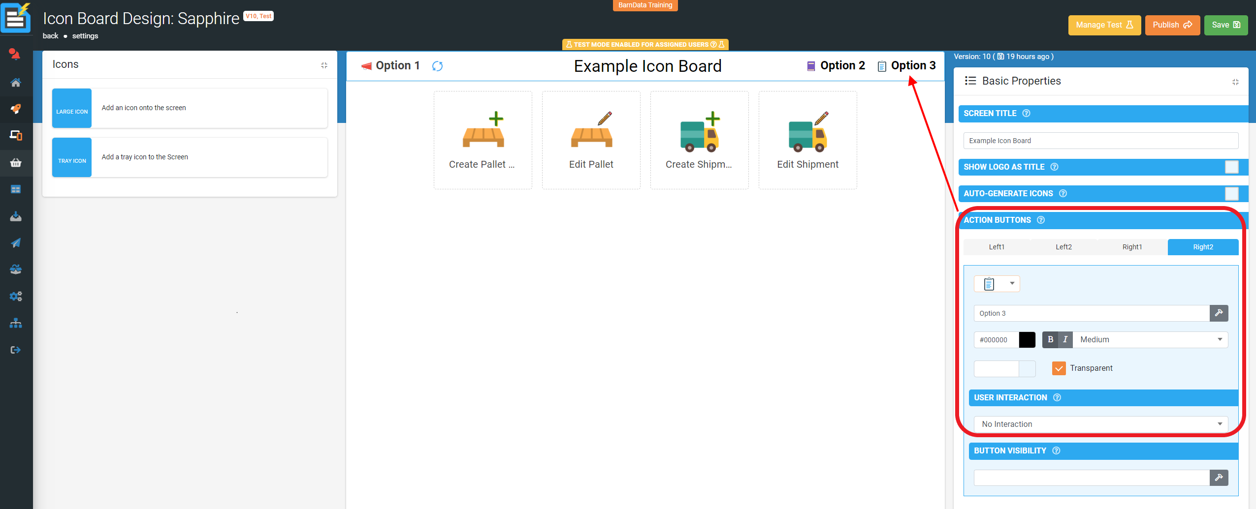
Title Bar Properties

Basic Properties
- Screen Title Text - displays on the title bar or you can opt to display the company's logo instead.
- Show Logo as Title – Super imposes the default company logo over the Screen Title.
- Automatically Generate Icons (Check Box) – When selected, adds icons for each Screen/Doc that the current user can access, removes the ability to add custom icons to the screen, but icons added when unselected are displayed.
- Action Buttons - Define additional buttons to appear on the title bar (LEFT, RIGHT1 or RIGHT2) that can have user interactions set.
- Button Visibility - Control the visibility of this button using a formula
Icon Properties

| Note: Not visible if “Automatically Generate Icons (Check Box)” is selected. |
Basic Properties
1. Icon Settings
- Select an icon
- Add static button text or dynamically control using functions.
- Select the button colour, transparency and size.
- Select the user interaction
2. Icon Visibility - Control the visibility of this icon using a formula.
Advanced Options
1. Badge Settings - Displays the given text as a circular badge on the icon.
- Add static badge text or dynamically control using functions.
- Select the badge colour, transparency and size.
2. Badge Visibility - Control the visibility of this button using a formula.
Tray Icon Properties

Basic Properties
1. Icon Settings - Configure icon display and behaviour.
- Choose Icon to display
- Change icon to one colour if desired, selecting the transparent (Check Box) removes colour and returns icon back to default.
- Icon Visibility - Control the visibility of this icon using a formula.
Advanced Options
1. Badge Settings - Displays the given text as a circular badge on the icon.
- Add static badge text or dynamically control using functions.
- Select the badge colour, transparency and size.
2. Badge Visibility - Control the visibility of this button using a formula.