Repeat Group
You can use either of the 3 repeatable field types to enable your users to capture various multiple entries of data.
Identifying how you want to capture multiple sets of data in the same format will help in deciding which field type to use:
If you want to repeat an entire page, click the Page image.
If you want a certain section of data on a page to be captured repeatedly, click the Table image.
If you mainly want to capture multiple images displayed as thumbnails, click the Gallery image.
| NOTE: The Gallery field is available only on the Premium subscription plan. |
Page Field
A Basic field type allowing grouping of various fields together in one screen with optional repeatable functionality.
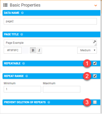
By selecting a Page field that has been added to your Form Designer, you can view its Basic Properties that will allow you to configure the following properties.
- Repeatable
- Repeat Range
- Prevent Deletion of Repeats
You can select the page Basic Properties by left-clicking on the page field as shown below.
- Repeatable:
Allow this page to repeat its fields.
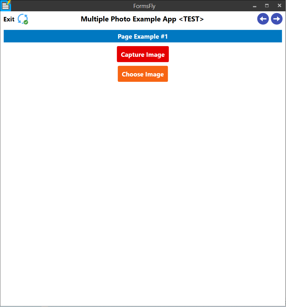
The App will prompt the user as to whether they want to keep adding more repeats of this Page.
- Repeat Range:
Minimum and/or maximum times this page should be repeated.
If Minimum is set, the App will automatically repeat this Page that number of times. Thereafter the user is prompted to add more.
Once Maximum repeats is reached, the App will move to the next Page
- Prevent Deletion of Repeats:
By default, users can delete repeats via a button provided at the top of each repeatable Page. This option removes the button, preventing repeat deletion. This is useful for cases such as pre-populated and/or fixed repeats.
| NOTE: The Page title will appear as part of the prompt when being asked to add a repeat, keep this in mind when giving the Page a title. |
Table Field
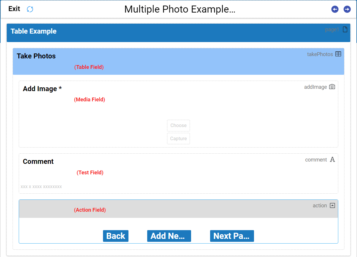
An advanced field type allowing for a set of fields to be shown as editable rows of repeated captured data within a Form page.
Adding fields into the Table field in the Form Designer that you want to capture repeated entries of will be displayed as rows with the respective field titles as column headers in the App.
| NOTE: The Table field has its own dotted line border that indicates fields within it. |
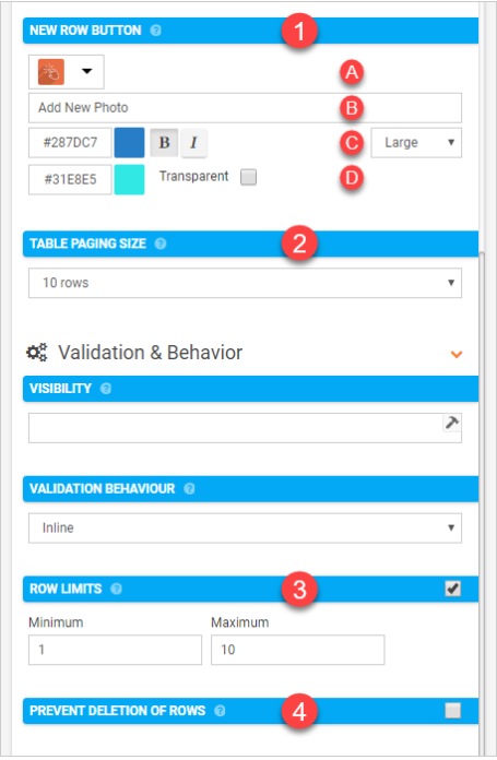
By selecting a Table field that has been added to your Form Designer, you can view its Basic Properties that will allow you to configure the following properties.
- New Row Button
- Table Paging Size
- Row limits
- Prevent Deletion of Repeats
- New Row Button:
Customise the button which allows the user to add new rows to the Table. If left blank, a standard button is shown with text of 'Add Row' or local equivalent.- Button icon
- Button text
- Customise button text
- Customise button background
- Table Paging Size
The maximum number of rows to display on this Table. If the Table is populated with more rows than this maximum, the app will show paging buttons to enable the user to look through all rows
- Row Limits
Minimum and/or maximum rows this table can contain. Currently, the maximum can be no larger than 50 rows.
- Prevent Deletion of Rows
By default, users can delete rows via a button provided at the top of each Row Page. This option removes the button, preventing row deletion. This is useful for cases such as pre-populated and/or fixed Table rows.
In the App, selecting the “add new” button to create an entry or selecting a row to edit the fields of an existing entry is how the Table field is populated with repeating data.
| NOTE: While you can take photos in a Table field, they won't be displayed as rows in the Table on the mobile App. |
In both cases above, you will be able to capture as many repeat instances of your target fields as desired.


